Page blocks
Every page in CourseLit is made up of various blocks, stacked in a top-to-bottom fashion. Each block serves a unique purpose and can be customized.
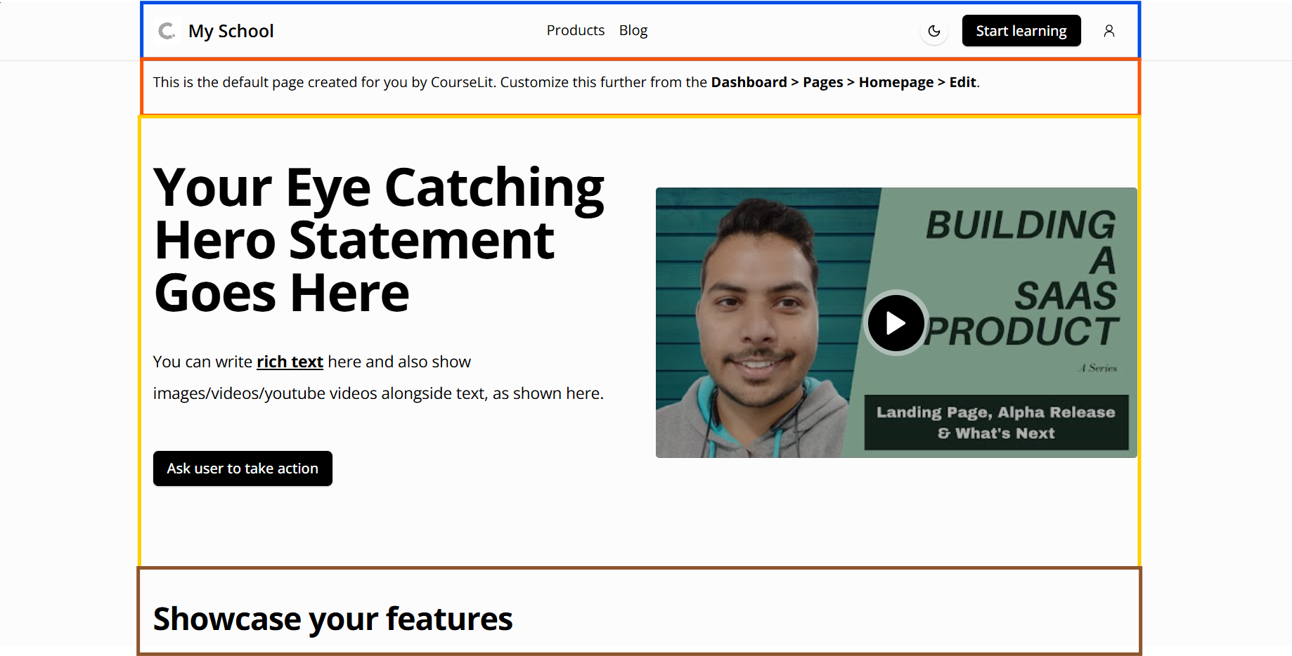
The following screenshot shows Header, Rich Text, Hero, and Grid blocks (top to bottom) in action. Different blocks are highlighted in different colors.
Blocks
CourseLit offers a wide range of page blocks so that you can build all sorts of web pages.
Header
This is a shared block. All published changes to this block impact all pages on your website.
The header block serves as the header of a page. It is used for housing the site’s navigation, etc. This block cannot be deleted from a page.
Adding links
You can add navigation links by following the steps below.
- Click on the header block to reveal its settings side pane.
- Click on the
Add new linkbutton in theLinkssection. This will add a newLinkitem as shown below.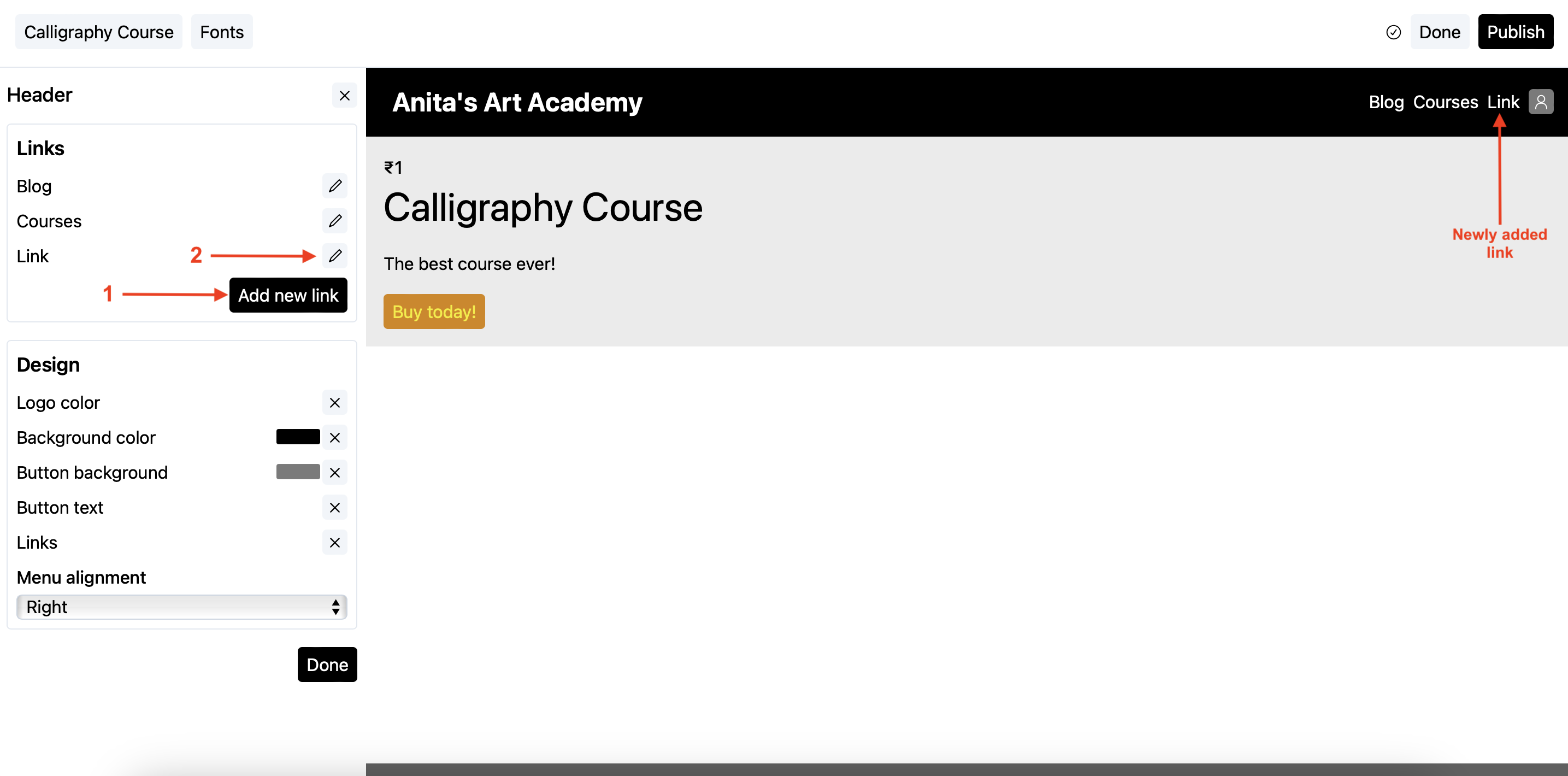
You will also see the newly added link on the header itself.
- Click on the pencil icon against the newly added link to edit it as shown above.
- Change the label (displayed as text on the header block) and the URL (where the user should be taken upon clicking the label on the header) and click
Doneto save.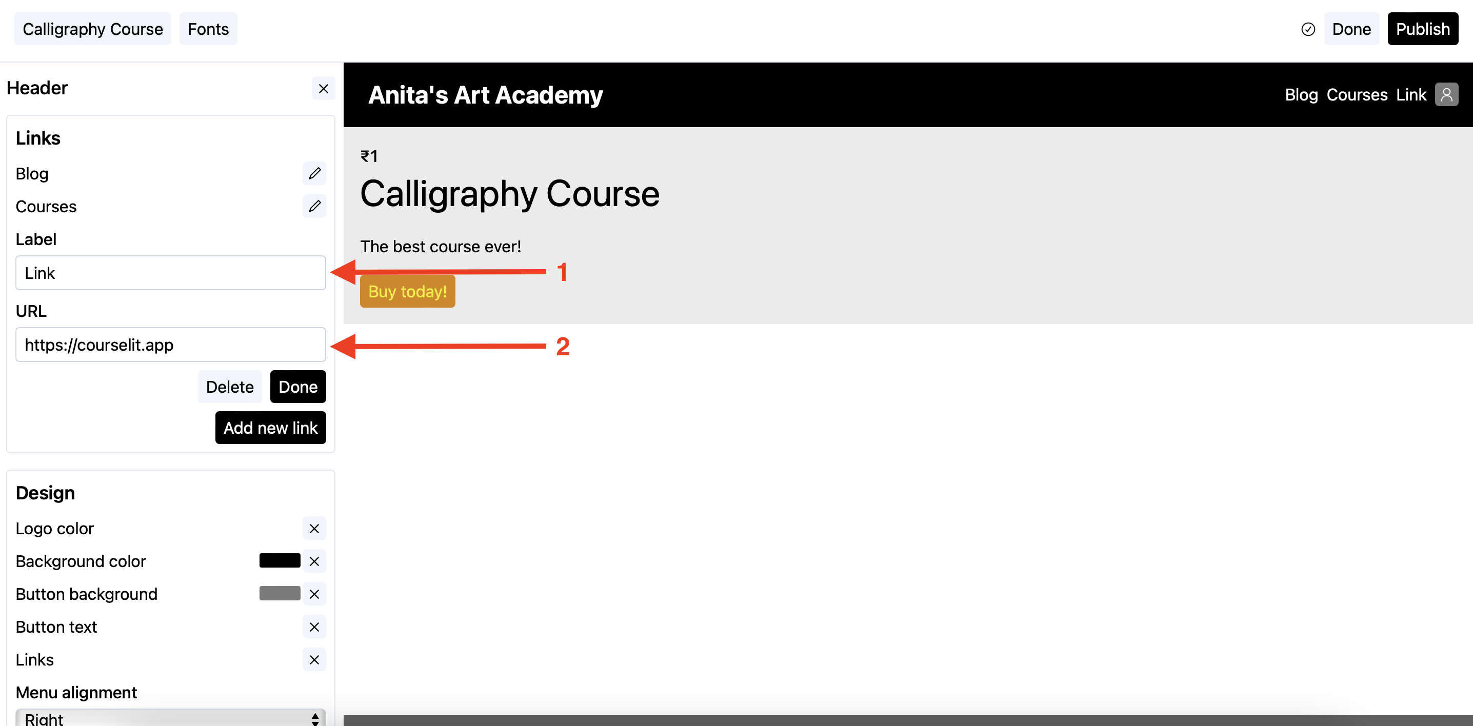
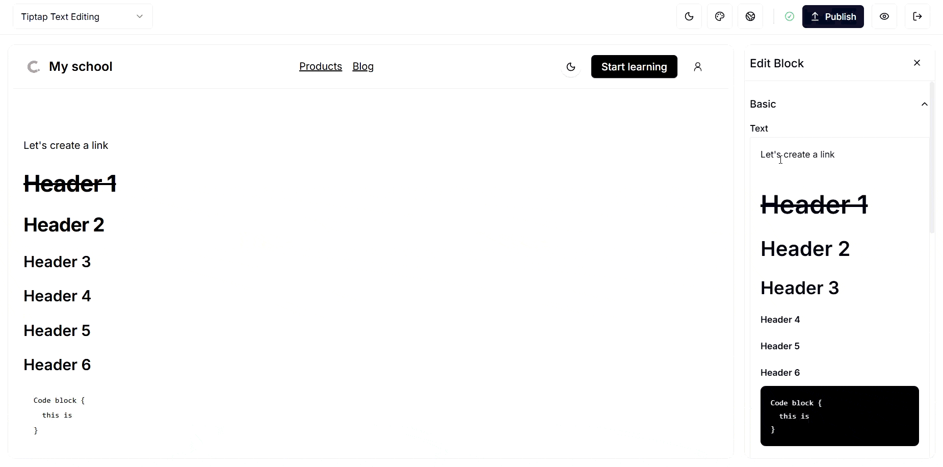
Rich Text
The rich text block uses the same text editor available elsewhere on the platform. It supports all functionality that does not require a toolbar, as the toolbar is hidden in this block.
Keyboard shortcuts
- Select the text.
- Use the following shortcuts to format it:
- Bold: Ctrl+B
- Italic: Ctrl+I
- Underline: Ctrl+U
- Strikethrough: Ctrl+Shift+S
- Undo: Ctrl+Z
- Redo: Ctrl+Shift+Z
- Paste: Ctrl+V
- Ordered list: Ctrl+Shift+7
- Bulleted list: Ctrl+Shift+8
- Highlight: Ctrl+Shift+H (or type
==two equal signs==)
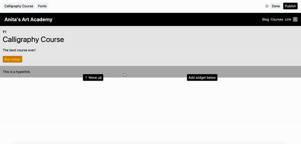
Creating hyperlinks
- Select the text.
- Click on the floating
linkicon to reveal a text input. - In the popup text input, enter the URL as shown below and press Enter.
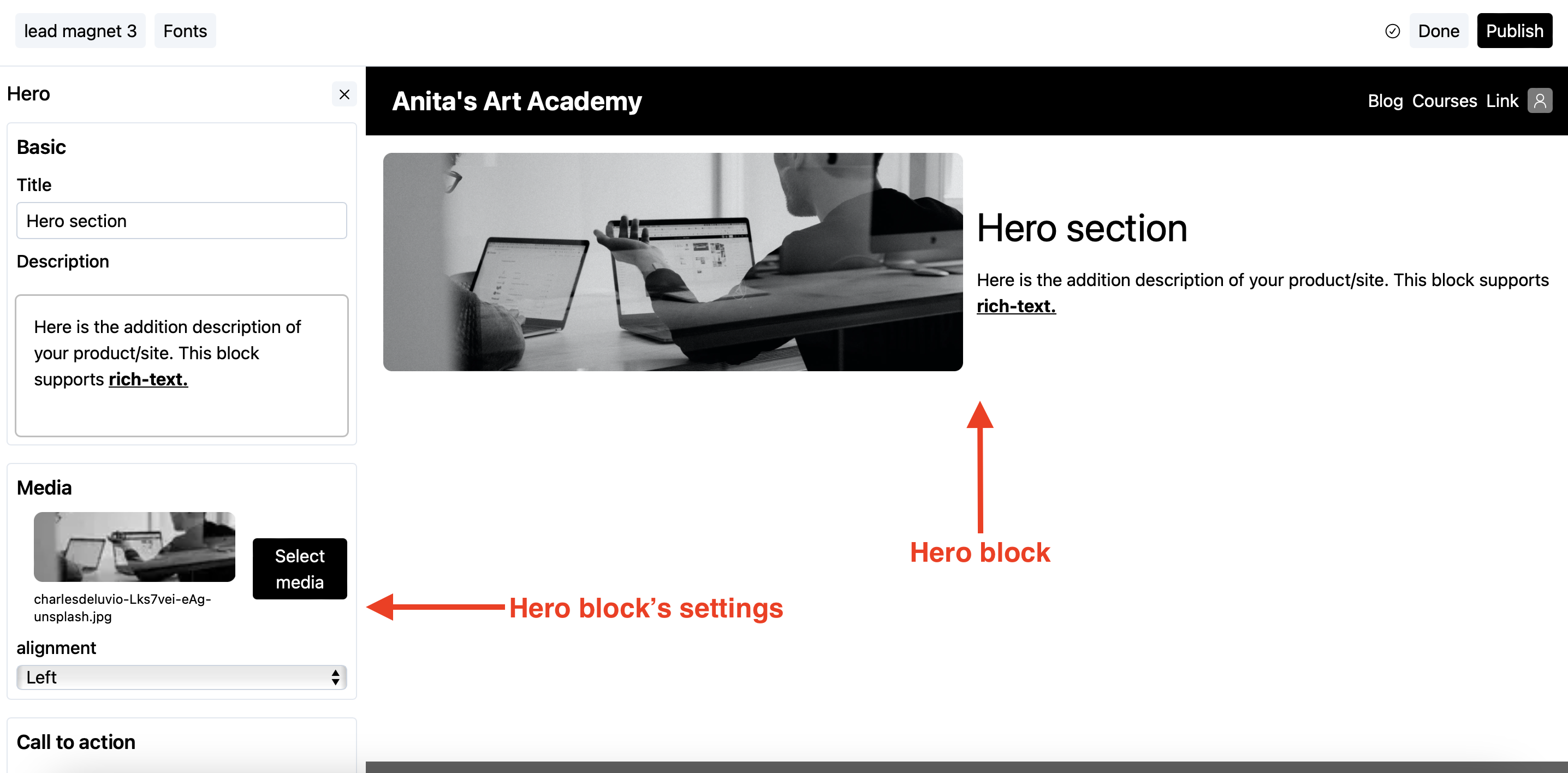
Hero
A hero section of a web page is the section that immediately appears on screen, just under the header. The hero block helps you put the information front and center.
You can add text, rich text, images, and a call-to-action (CTA) button to the hero block.
Following is how it looks on a page.
Customizing the call-to-action button
- Click on the hero block to reveal its settings.
- Scroll to the
Call to actionsection.
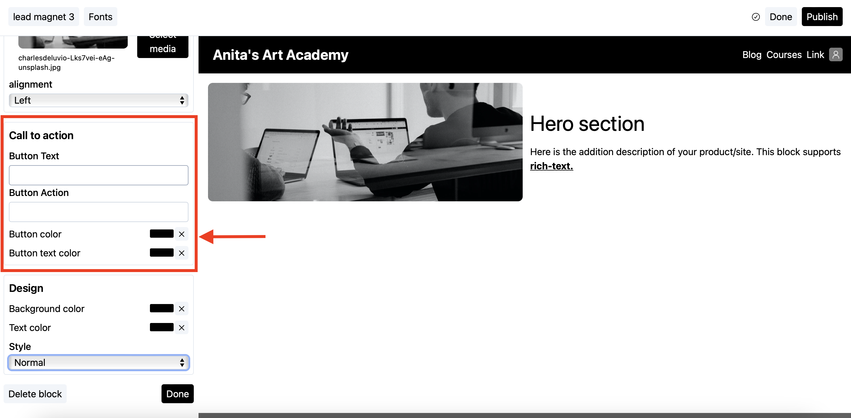
- In the button text field, add the text that will be visible on the button.
- In the button action, enter the URL the user should be taken to upon clicking.
a. If the URL is from your own school, use its relative form, i.e.,
/courses. b. If the URL is from some external website, use the absolute (complete) URL, i.e.,https://website.com/courses.
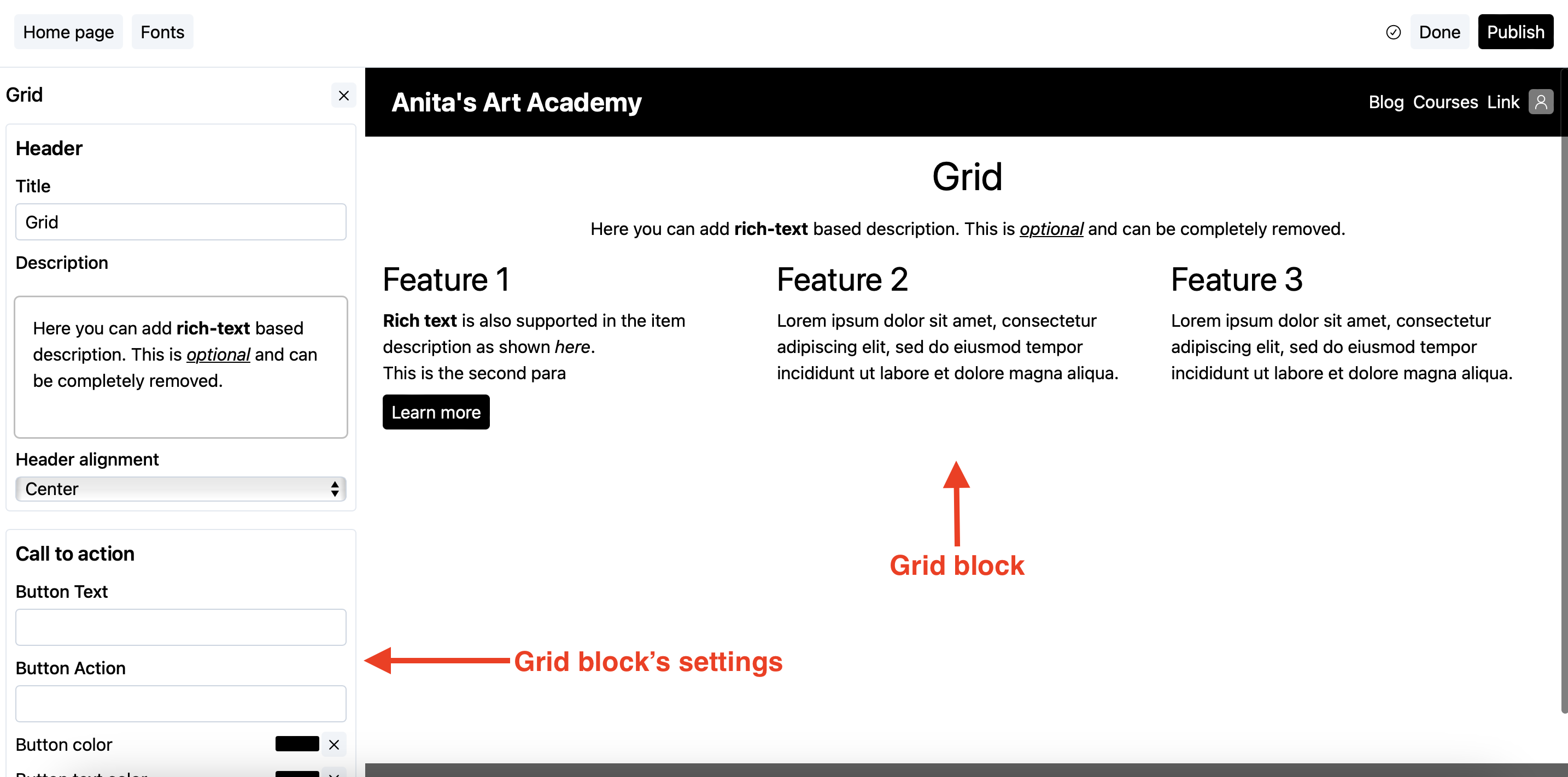
Grid
A grid block comes in handy when you want to show some sort of list, for example, features list or advantages, etc. The list gets displayed in the grid format as shown below.
Add an item
- Click on the grid block to reveal its settings.
- Scroll down to the
Itemssection as shown below.
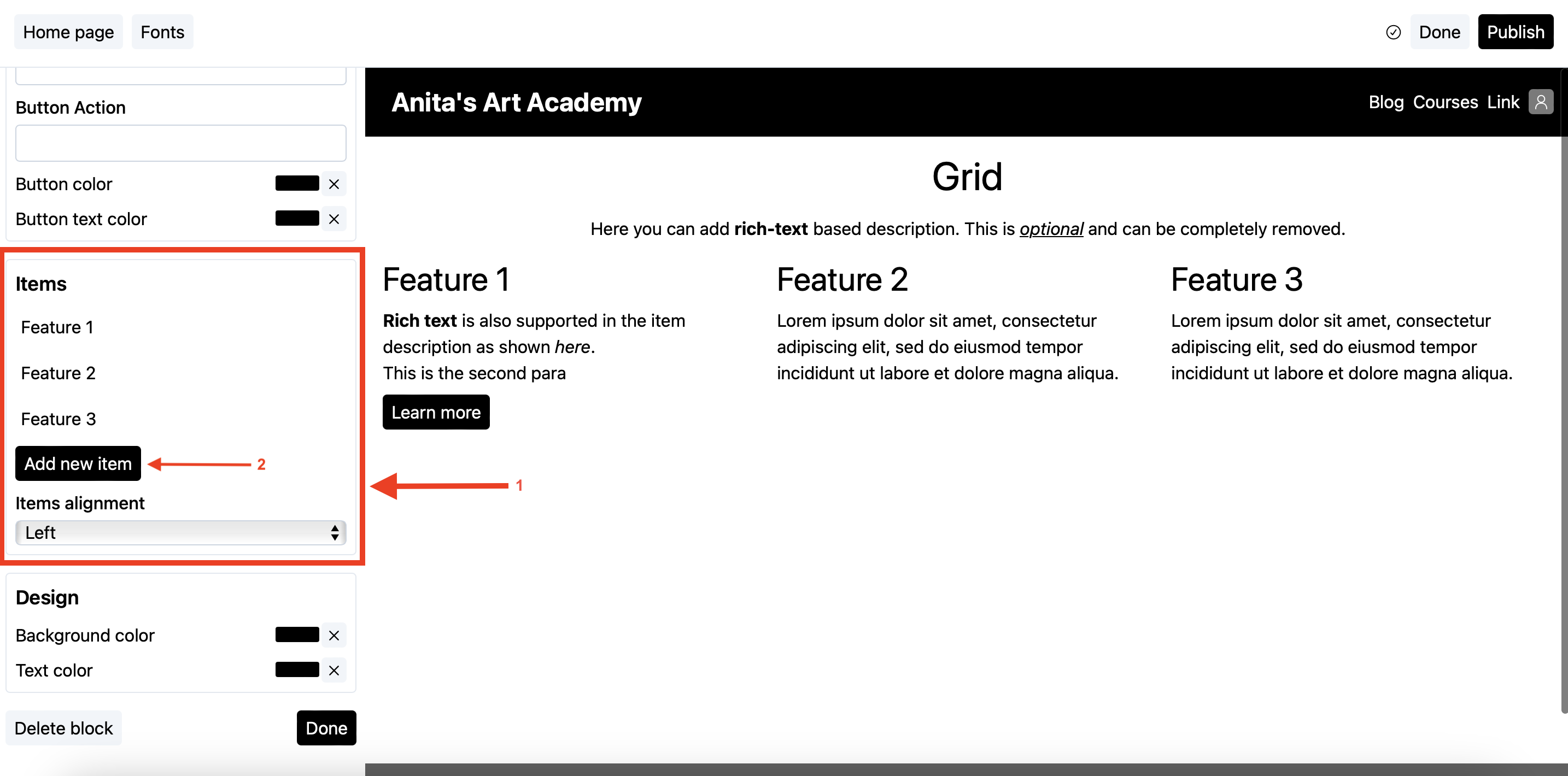
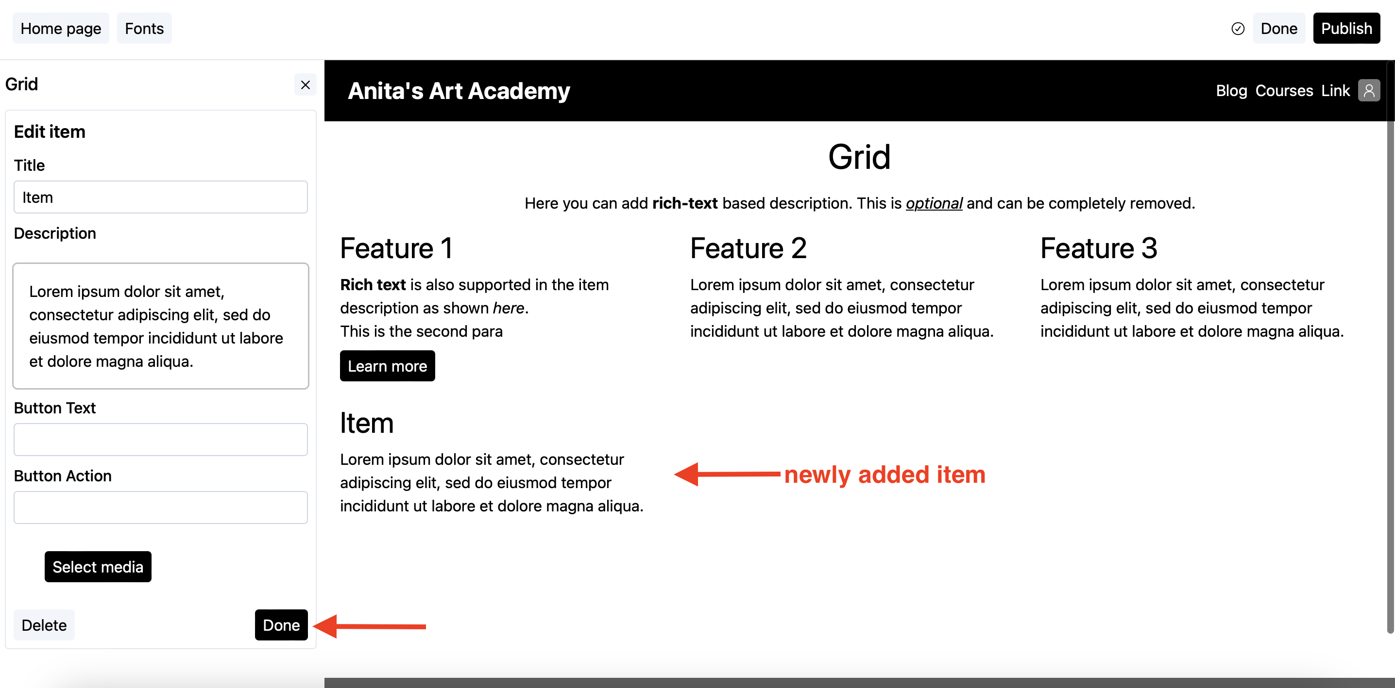
- Click on the
Add new itembutton as shown above. This will open up the item’s editor. - Change the details as per your liking. See the customizing the call-to-action button guide to check how to customize the item’s call-to-action button. Once done, click on the
Donebutton.
Delete an item
- Click on the grid block to reveal its settings.
- Scroll down to the
Itemssection as shown below.
- Click on the item you want to remove. This will open up the item’s editor.
- Click on the delete button to delete the item.
- You will be taken back to the grid block’s settings.
Customizing the call-to-action button
- Click on the grid block to reveal its settings.
- Scroll to the
Call to actionsection.
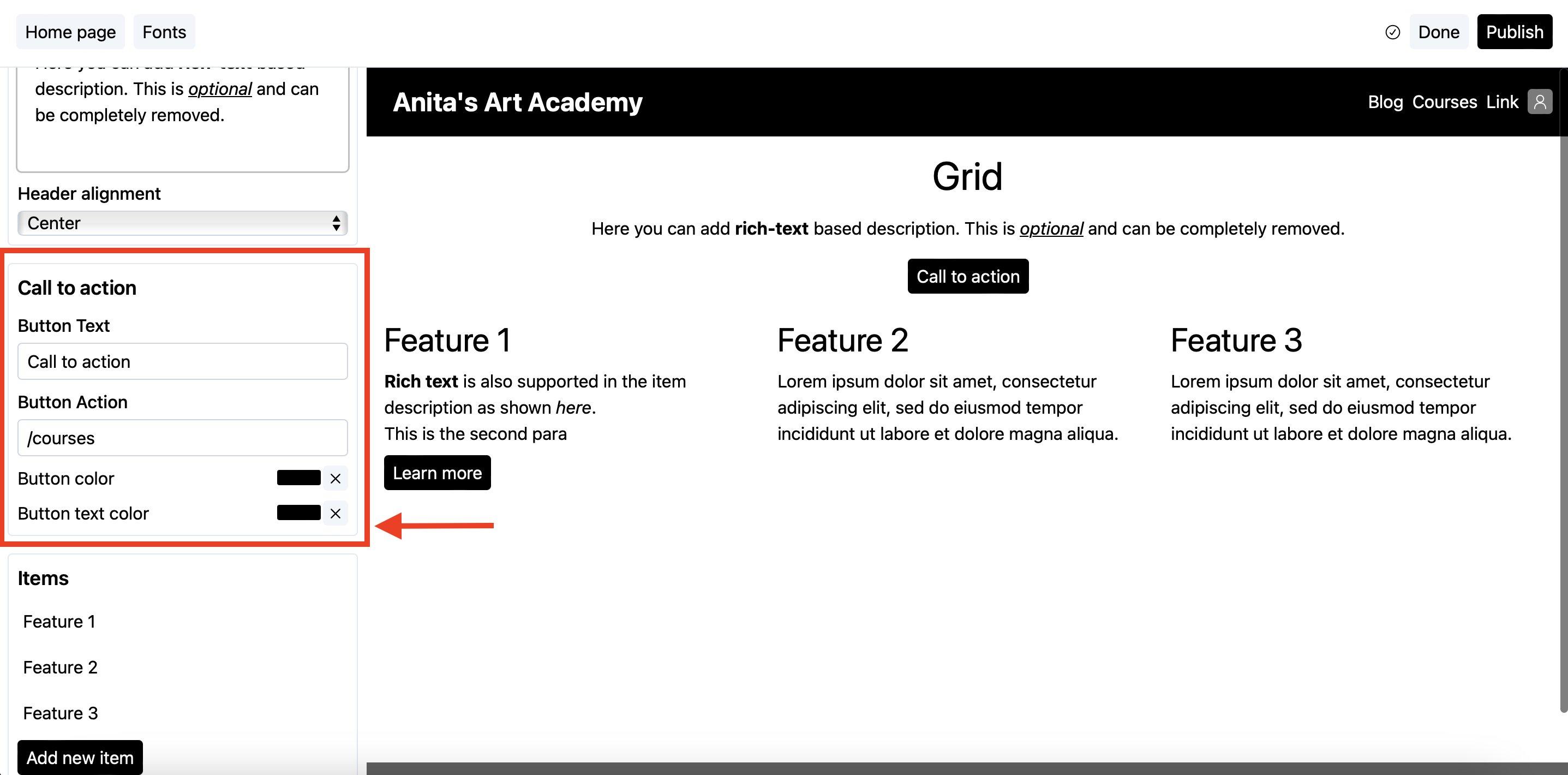
- In the button text field, add the text that will be visible on the button.
- In the button action, enter the URL the user should be taken to upon clicking.
a. If the URL is from your own school, use its relative form, i.e.,
/courses. b. If the URL is from some external website, use the absolute (complete) URL, i.e.,https://website.com/courses.
Featured
If you want to show your other products on a page, the featured widget is the one to use.
Following is how it looks on a page.
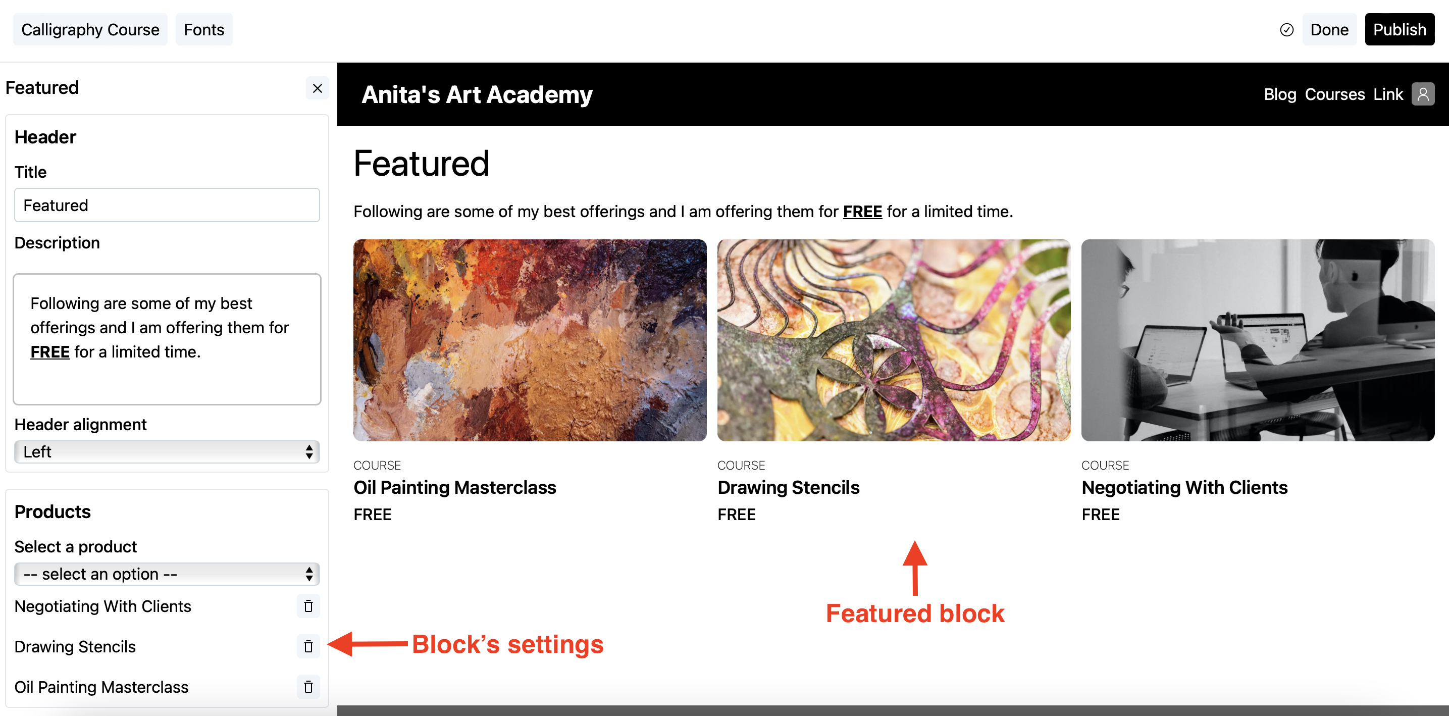
Add featured products on your page
- Add the
Featuredblock on your page. See here for how to add blocks to a page. - Go to the products section and select the products from the dropdown list as shown below.
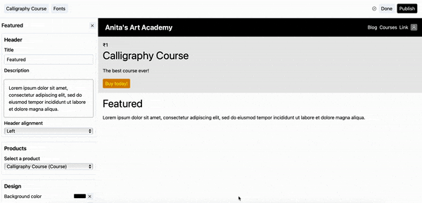
- To delete an entry from the featured list, click on the delete button against the entry in the products section (also demonstrated in the above screengrab).
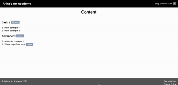
Curriculum
This block can only be added to the products’ sales pages.
This block shows the content of your product, i.e., Sections and Lessons in your product. Using this, you can show the index of what your product offers.
Following is how it looks on a page.
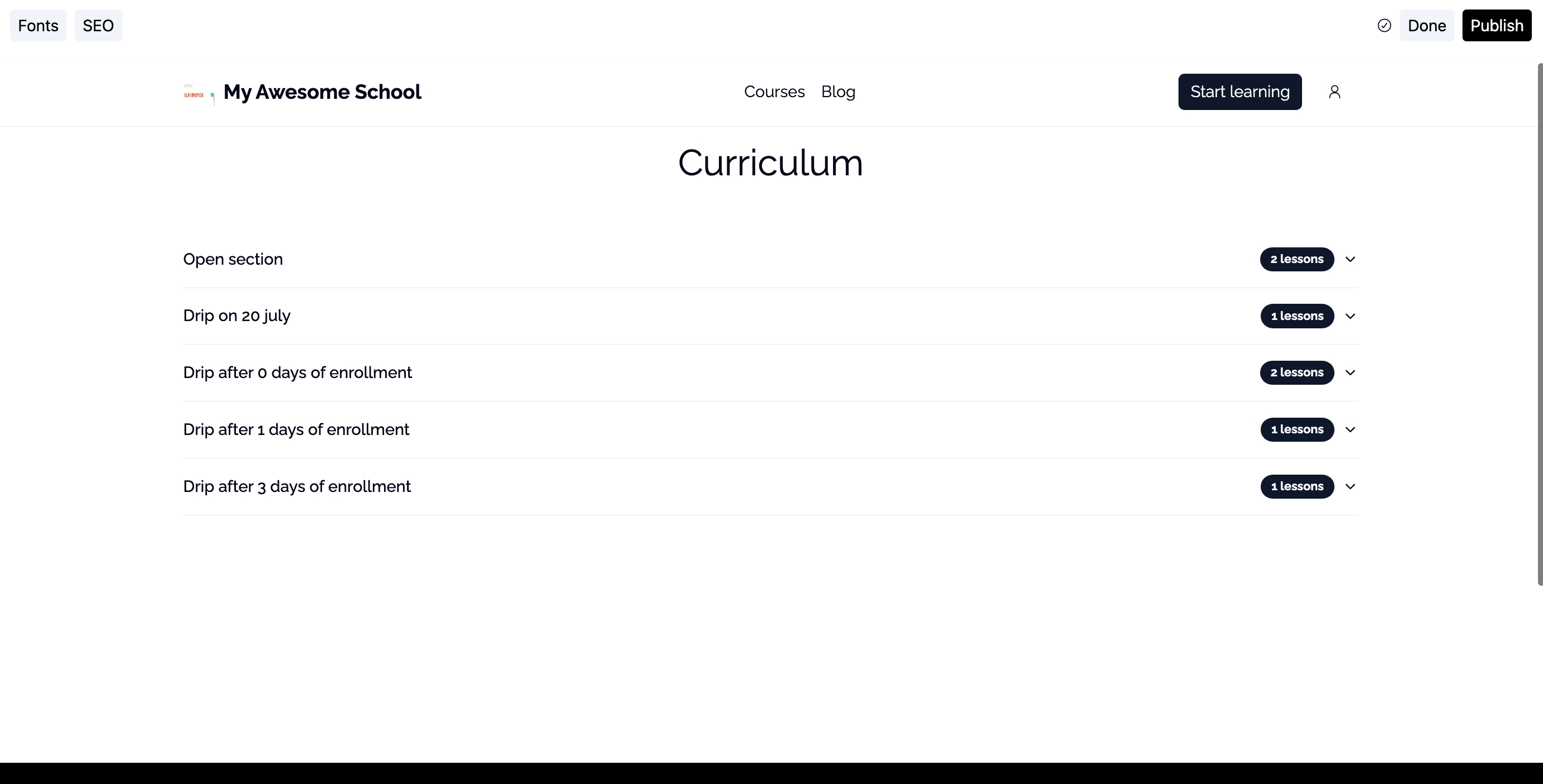
There are two sections with two lessons each in the product demonstrated above.
Your audience can directly click on the lessons to see them in the course viewer. The preview lessons are indicated distinctly so that your audience can easily check out the free parts of your product.
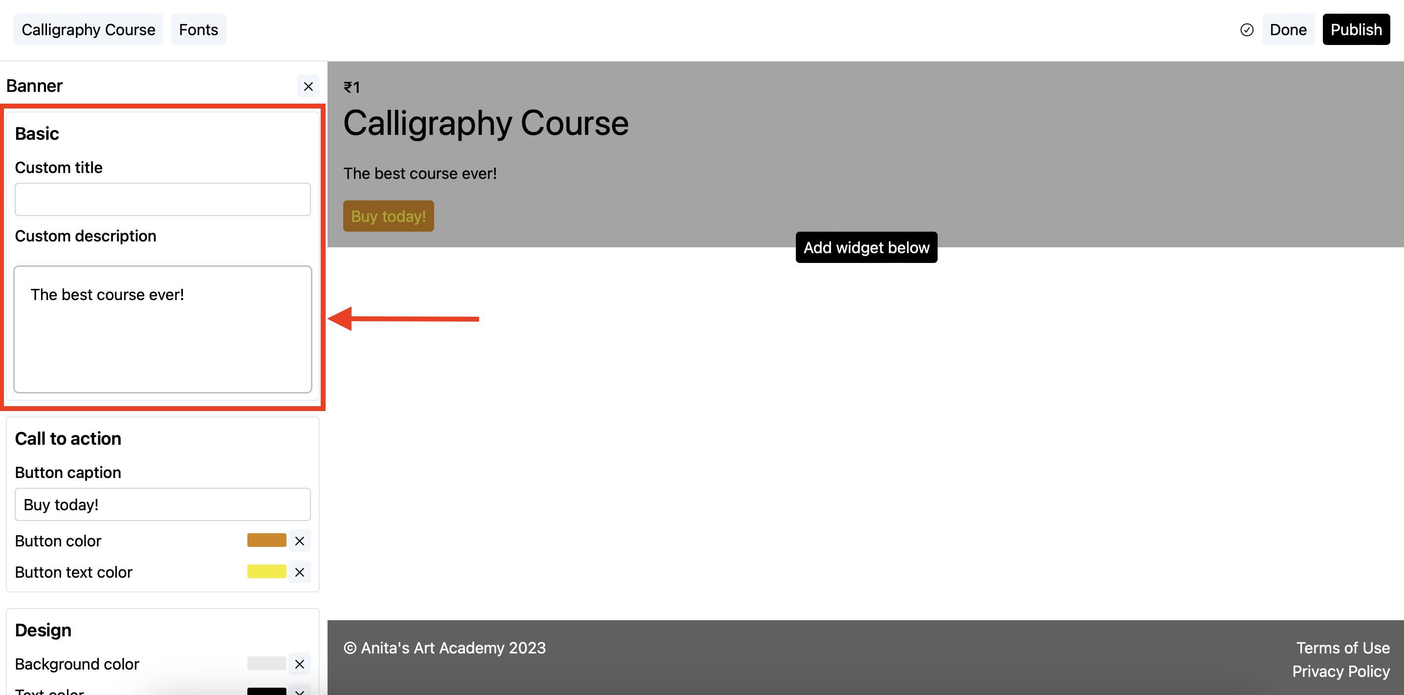
Banner
The banner block is the default block that shows the basic information about the page, i.e., on a sales page it shows the product’s details like its title, description, featured image, and pricing, and on the homepage it shows your school’s details like its name and subtitle.
Overriding details
By default, the banner block shows the details from your product or school depending upon which type of page it is displayed on.
These details, however, can be overridden at the block level. Following is how:
- Click on the banner to reveal its settings.
- Change the relevant details from the
Basicsection.
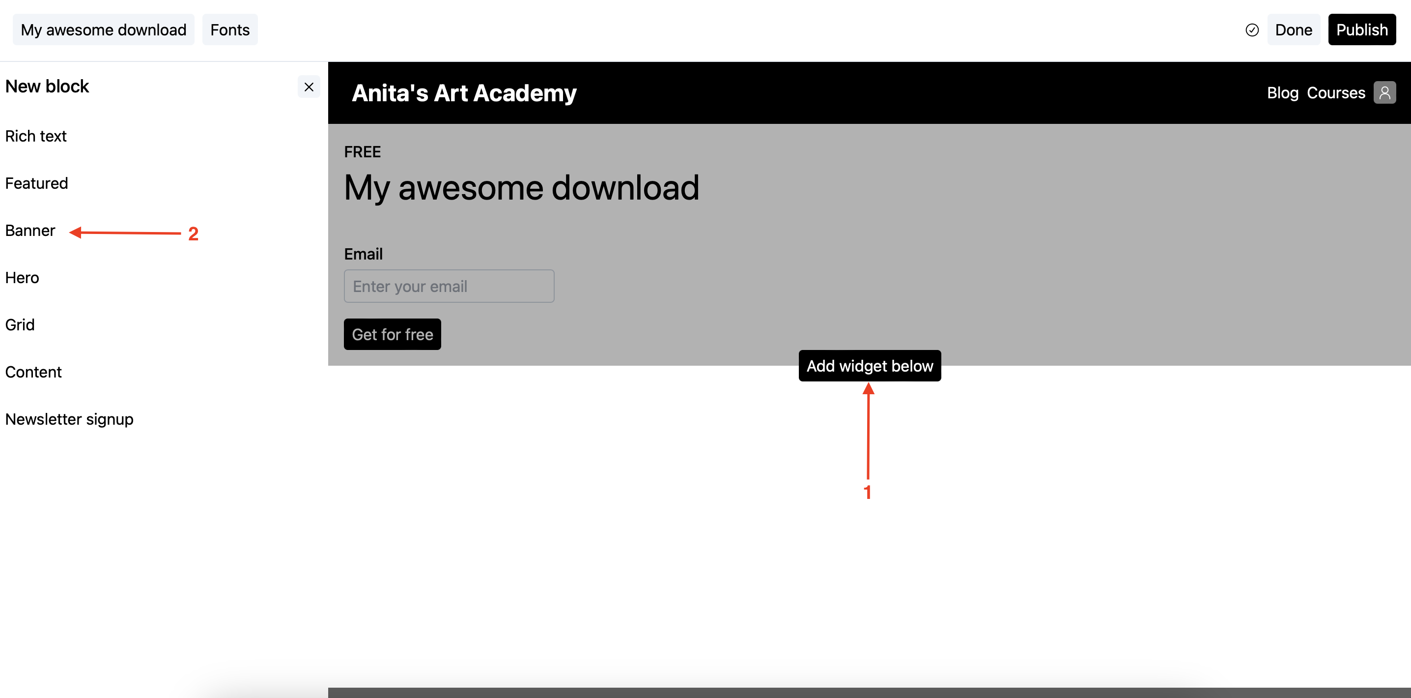
Creating a lead magnet
The banner block can also be used as a lead magnet form. The pricing of your product should be set to Free email delivery. Following are the steps:
Steps
- Add the
Bannerblock on your page (if not already present).
-
In the banner’s settings screen, scroll to the
Call to action(aka CTA) section.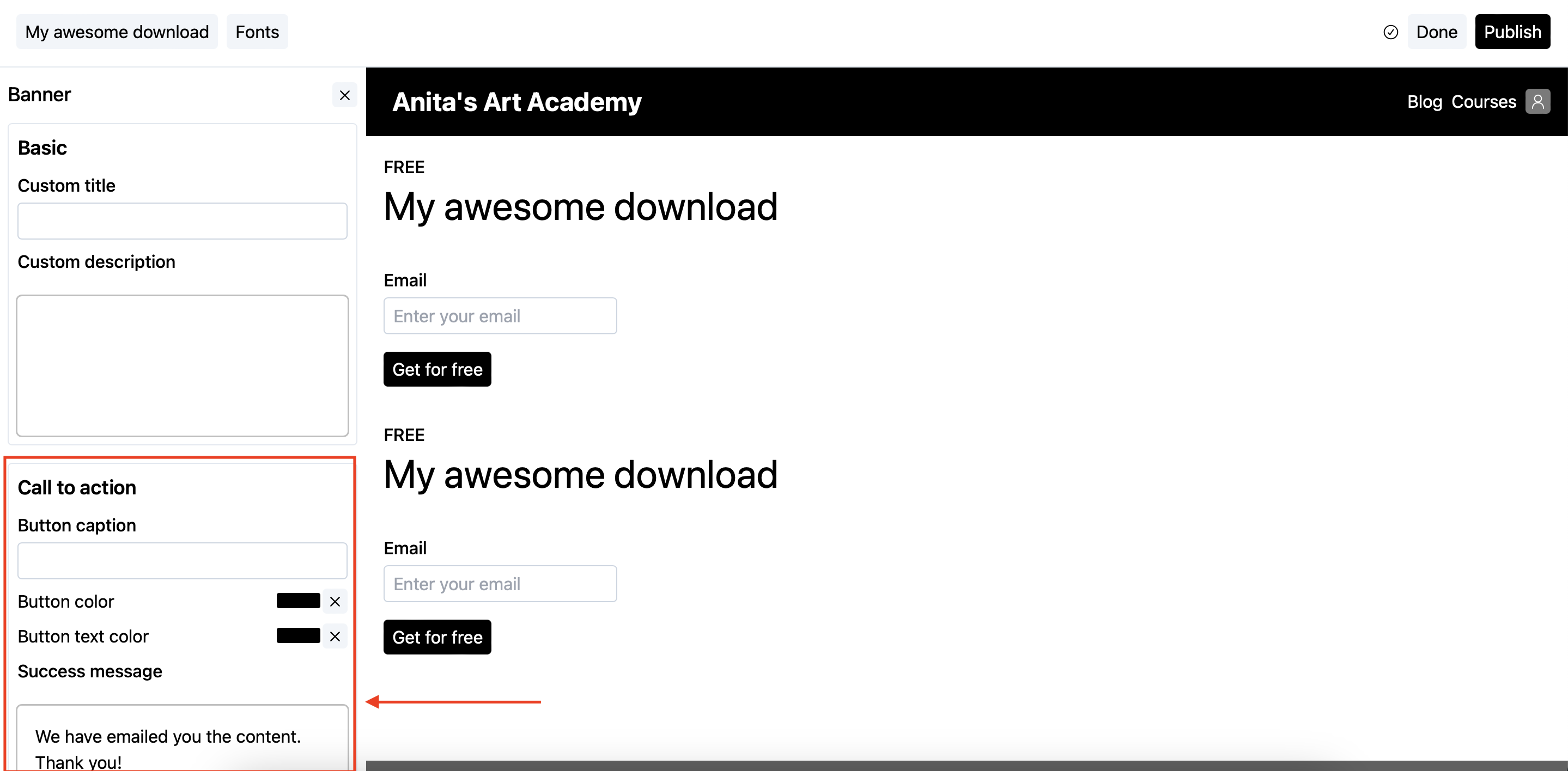
-
In the CTA section, put the asset link which you want to share with your audience in the
Success messagetext box.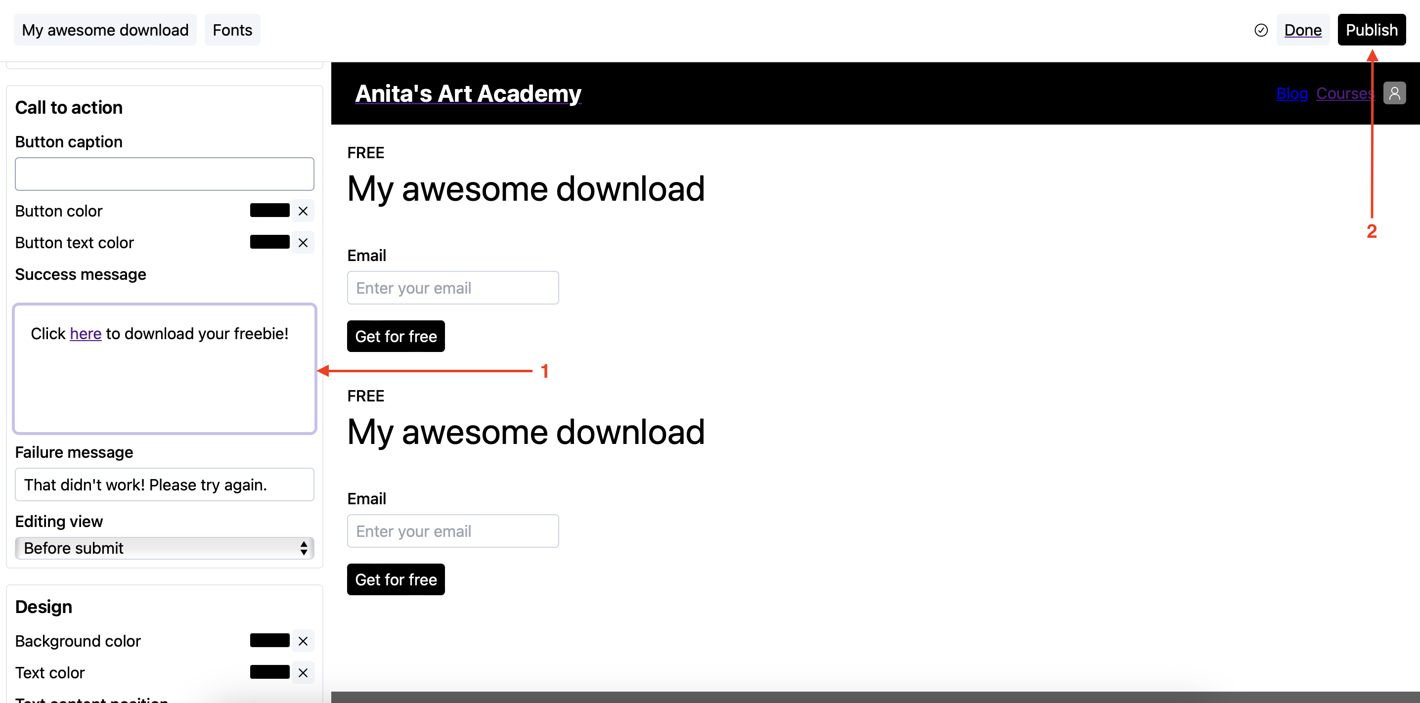
Make sure the link you are sharing here is open to the public and can be easily accessed.
- Publish the page.
Now, whenever your users enter their emails and press submit, they will see the text you entered in the Success message text box.
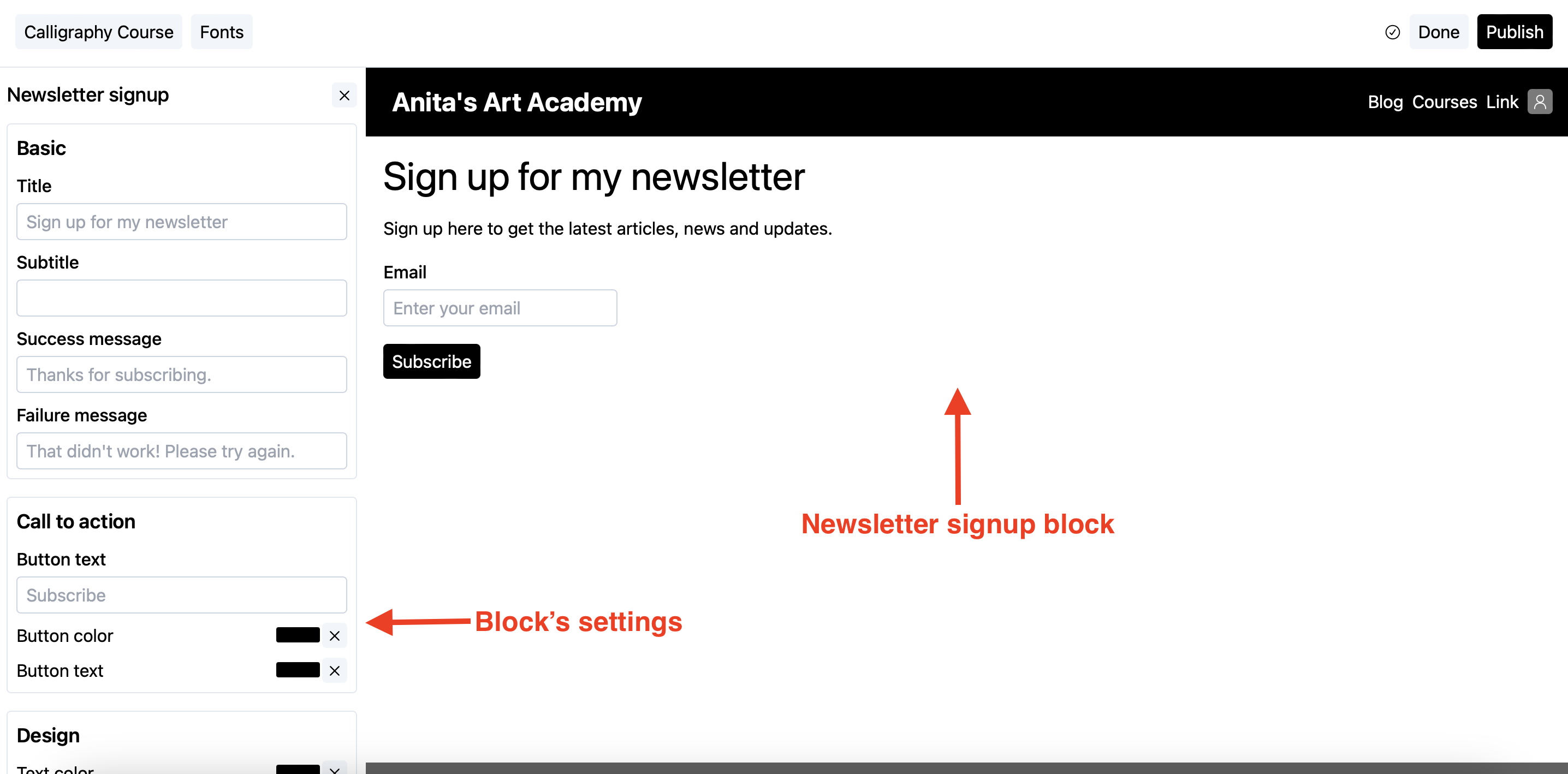
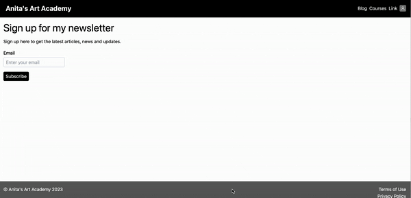
Newsletter signup
Having a mailing list to sell directly to is a dream of every business, big or small. That’s why CourseLit offers a dedicated block that lets you capture emails. It is also a shared block.
Following is how it looks on a page.
How it works
- Your audience will enter their emails in the text box on the Newsletter signup block.
- A user is created in your school.
- The user is automatically signed up for your newsletter.
- You can see the user in the
Userssection from the dashboard.
Following is an animation that shows the entire flow.
Embed
Embedding content from other websites is a common requirement. CourseLit offers a dedicated block that lets you embed content from other websites.
You can embed websites (using URL type) or widgets (using Script type).
The height of the content in case of Script type embed is automatically calculated. The Height property in the builder has no effect.
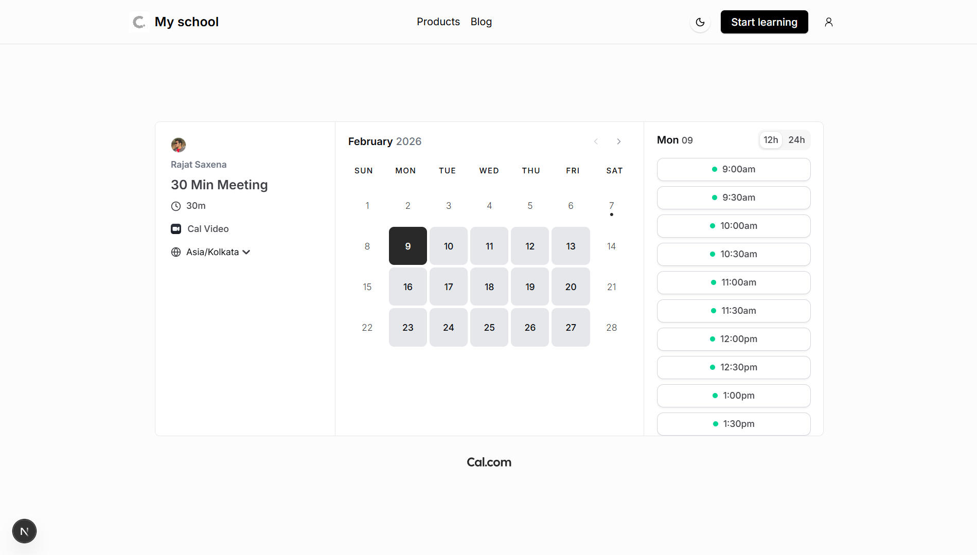
Following is how it looks while displaying a Cal.com calendar.
What embeds are supported
Although, CourseLit platform should support any embed code, we have tested with the following platforms:
- YouTube
- Vimeo
- Google Docs
- Microsoft Word
- Google Forms
- Typeform
- Microsoft Forms
- Google Calendar
- GitHub Gist
- Apple Podcasts
- SoundCloud
- Spotify
- Senja
- Addcal
Here is Cal.com’s embed looks on a page.
Embed code not working? Please reach out to us on Discord.
Footer
This is a shared block. All published changes to this block impact all pages on your website.
The footer block serves as the footer of a page. It is used for housing secondary but essential elements like links to terms and conditions, privacy policies, etc. This block cannot be deleted from a page.
Adding sections and links
- Click on the footer block to reveal its settings.
- In the
Sectionspanel, you can:- Add new sections (up to 5 sections)
- Rename sections
- Add, edit, or delete links within each section
- Reorder links using drag and drop
Customizing design
In the Design panel, you can customize:
- Title font size
- Maximum width
- Vertical padding
- Social media links (Facebook, Twitter, Instagram, LinkedIn, YouTube, Discord, GitHub)
Shared blocks
The Header and Footer are shared among all the website pages. These cannot be deleted from a page.
Since these are shared, publishing any changes to these will make those visible across your website.
Next step
Now that you have learned about page blocks, it is time to learn how to use them in your pages. See our edit a page guide for details.
Stuck somewhere?
We are always here for you. Come chat with us in our Discord channel or send a tweet at @CourseLit.