Themes
CourseLit’s Theme Designer is a powerful tool that allows you to customize the look and feel of your learning platform.
Built on top of shadcn’s design system, it provides a comprehensive set of options to create a unique and professional appearance for your website.
Every theme in CourseLit comes in two flavors - light and dark mode. This ensures your website looks great regardless of the user’s system preferences or time of day.
Currently, themes are only applied to the public pages of your school. The dashboard uses the system theme to provide a consistent experience. If you’d like themes to be applied to the dashboard as well, please leave your upvote here. The system theme also includes a dark mode.
Table of Contents
- System Themes
- Custom Themes
- Previewing a Theme
- Customizing a Theme
- Publishing Changes
- Switching Themes
- Supported Tailwind Classes
- Need Help?
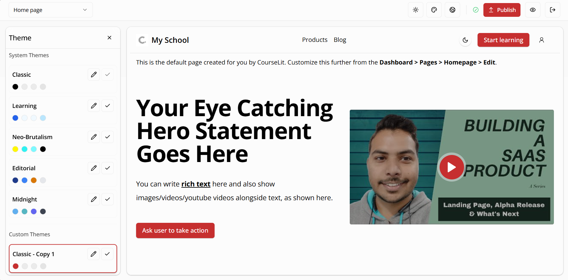
System Themes
System themes are pre-built themes that come with CourseLit. These themes are professionally designed and ready to use. They serve as a great starting point for your website’s appearance.
Currently, CourseLit offers the following system themes:
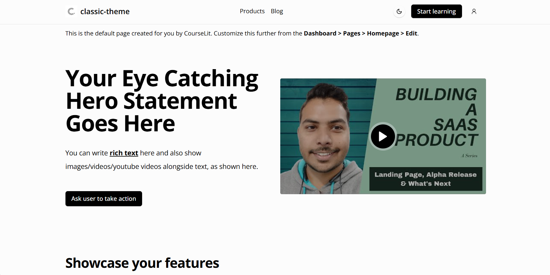
Classic (Default)
A clean, professional theme with balanced typography and subtle colors
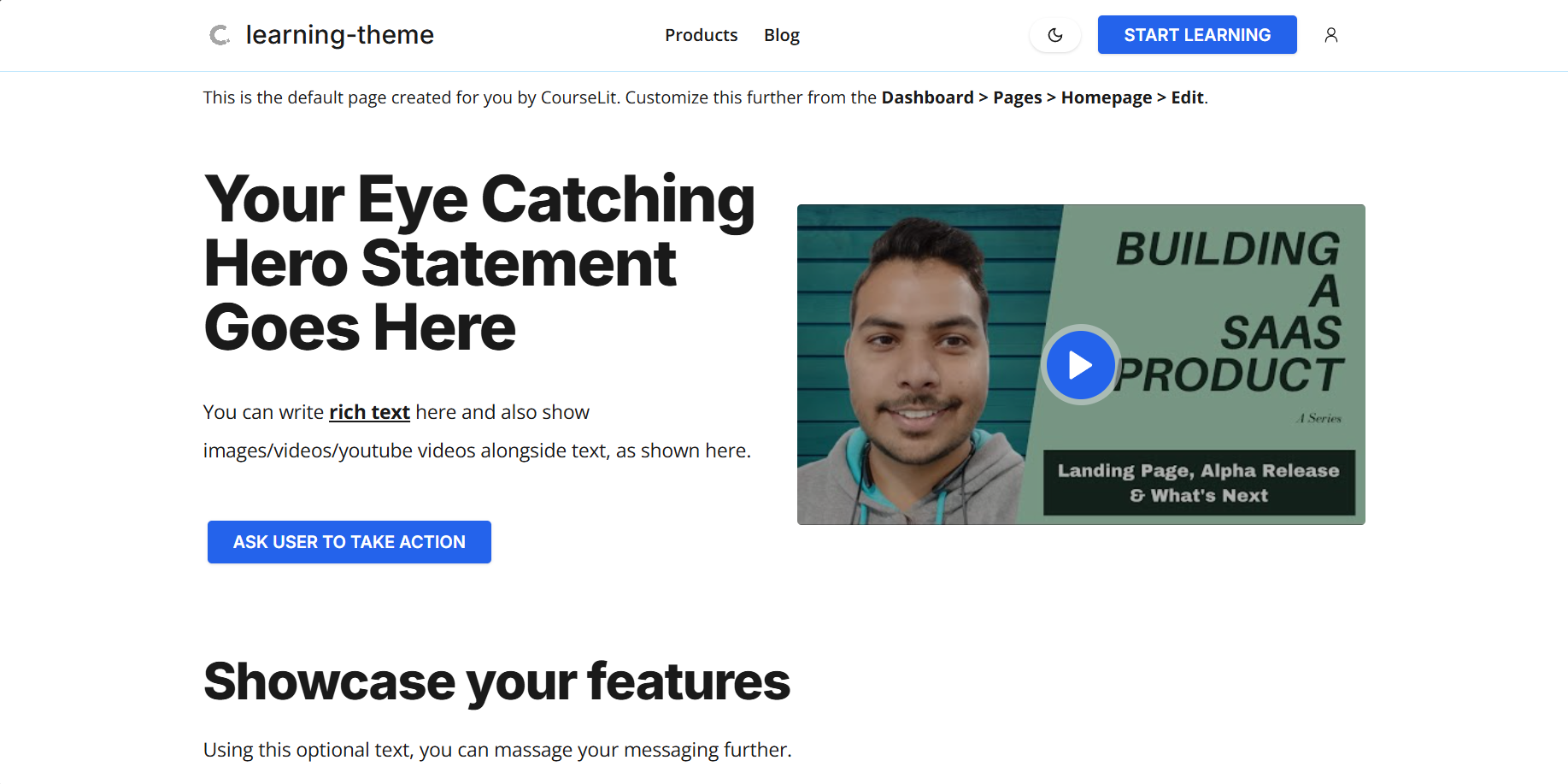
Learning
Optimized for educational content with enhanced readability
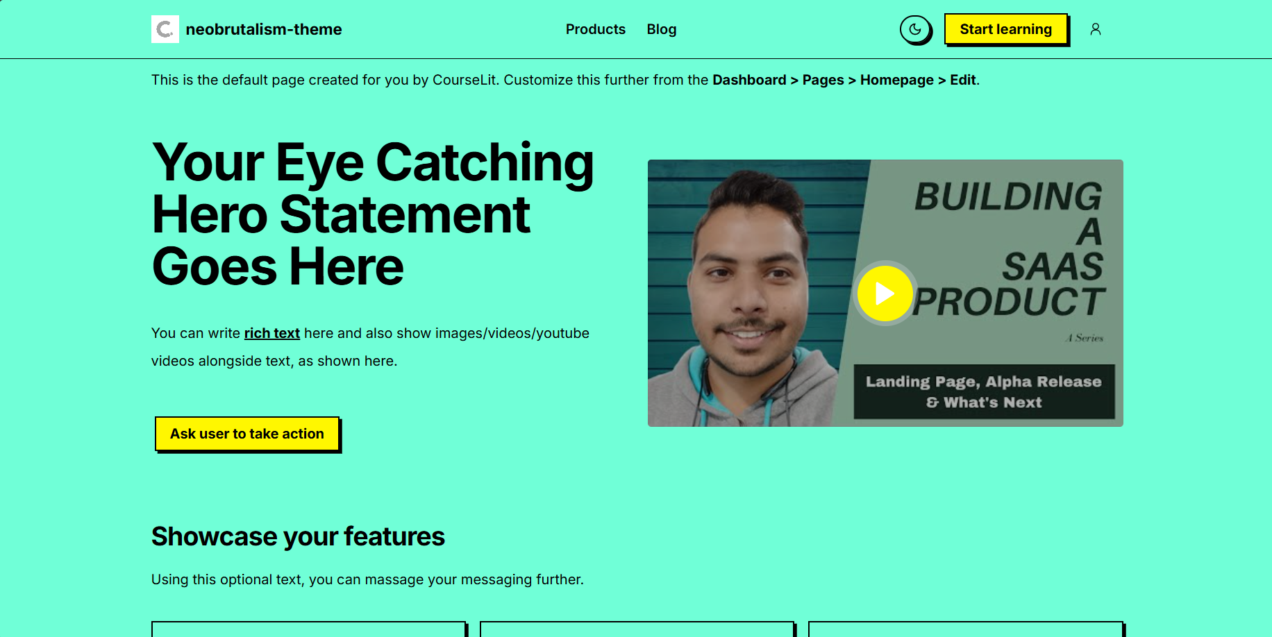
Neobrutalism
A bold, modern theme with strong typography and vibrant colors
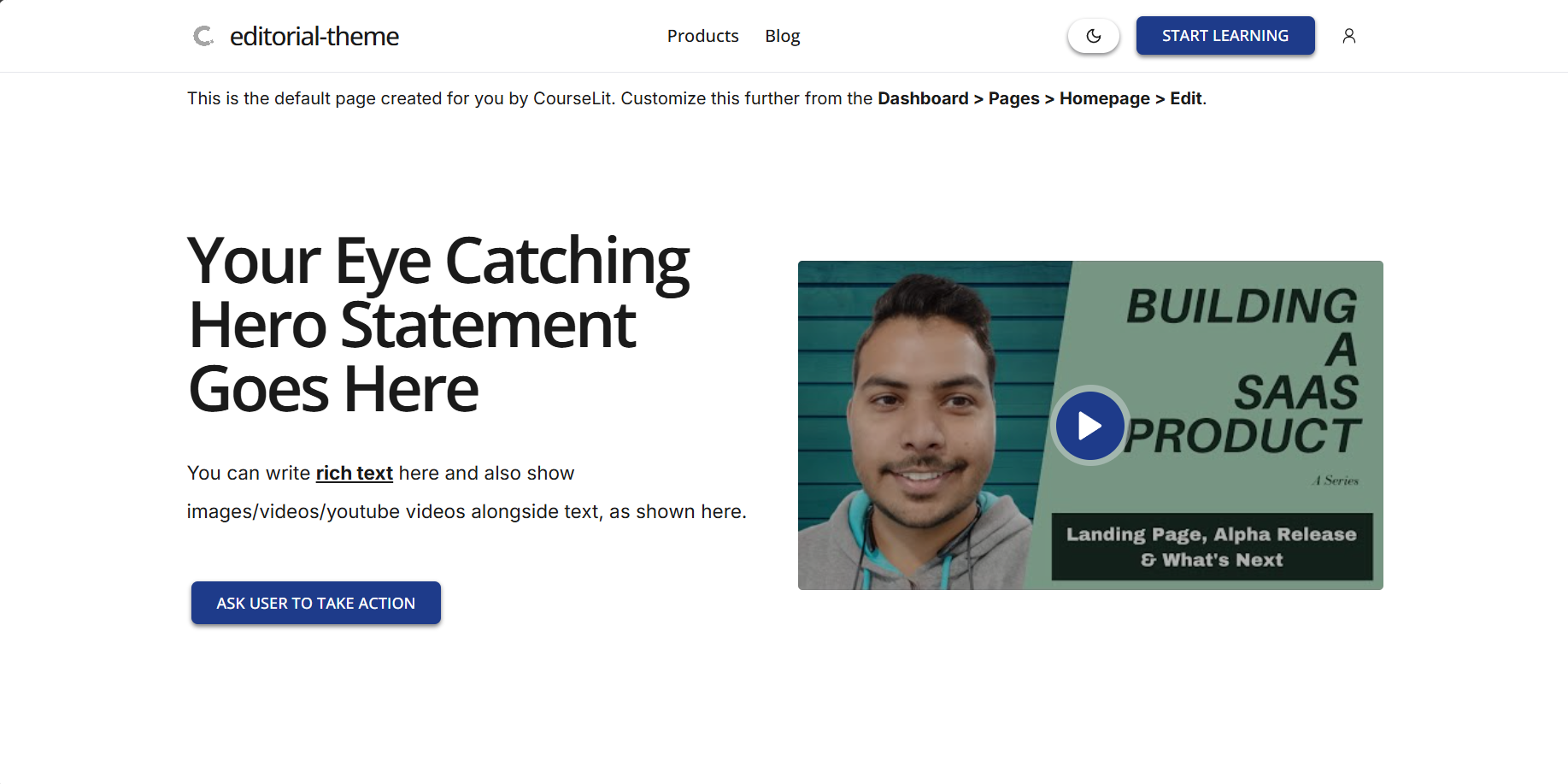
Editorial
A sophisticated theme inspired by editorial design
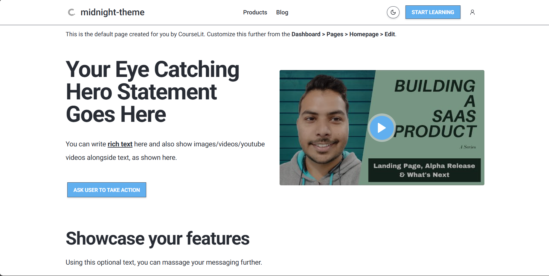
Midnight
A dark-focused theme with high contrast and dramatic elements
Each system theme can be used as-is or customized to match your brand identity.
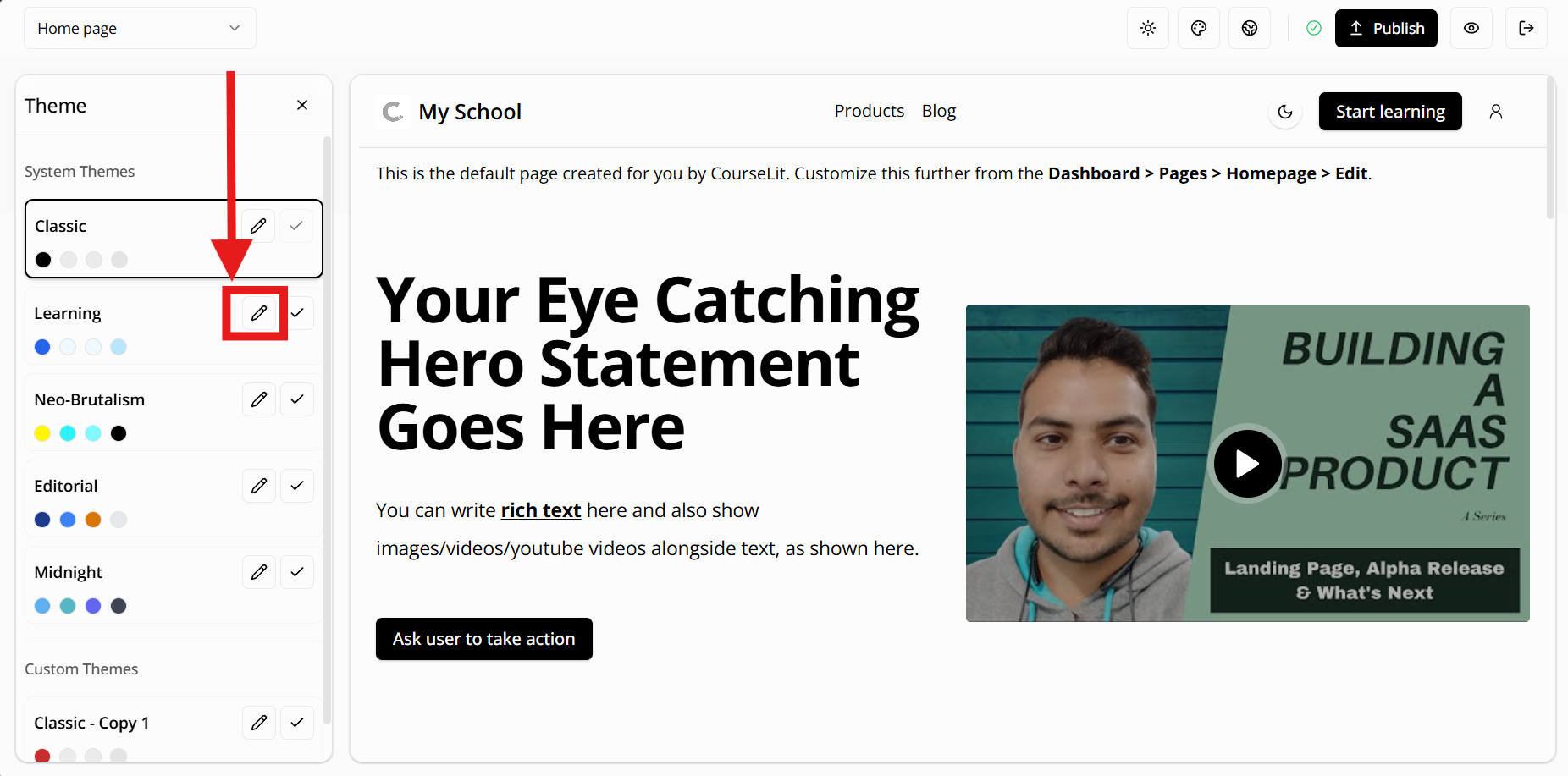
Custom Themes
Custom themes are your own creations or modifications of system themes. When you customize a system theme, CourseLit automatically creates a copy of it, allowing you to make changes without affecting the original.
To create a custom theme:
- Select a system theme as your starting point
- Click the “Edit” button to open the theme editor
- Make your desired changes
- To edit the dark mode settings, switch the theme using the moon icon (🌙) and make the changes
Your custom themes will appear in the “Custom Themes” section of the theme selector.
When you edit a theme, CourseLit remembers it and automatically selects it the next time you open the theme editor.
Previewing a Theme
Click on the theme card to preview it on your school. This will not switch the theme.
Customizing a Theme
The theme editor gives you complete control over your website’s look and feel. To start editing a theme, click on the pencil icon button on the theme’s card.
Understanding the auto save feature
Your theme changes are automatically saved as you work, so you can take your time perfecting the design.
These changes are stored as a draft version of your theme and are only visible while you’re actively editing that theme in the theme editor. When you’re ready to apply your changes to your live website, simply set the theme as active and click the publish button.
The theme editor offers several categories of customization options:
1. Colors
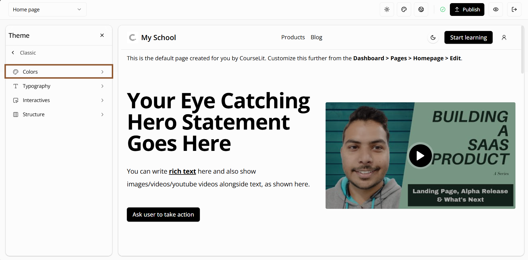
The color editor allows you to customize various aspects of your theme’s color scheme:
Primary Colors
Your main brand colors used for important actions and key elements
Secondary Colors
Supporting colors that complement your primary colors
Accent Colors
Highlight colors for special elements and calls-to-action
Base Colors
Fundamental colors for your website’s background and text
Card Colors
Colors for card components and content boxes
Popover Colors
Colors for floating menus and tooltips
Muted Colors
Subtle colors for less prominent elements
Border & Input Colors
Colors for borders and form fields
Destructive Colors
Colors for error states and warning messages
Chart Colors
Colors for data visualization and graphs
Sidebar Colors
Colors for the navigation sidebar
Shadow Styles
Customize shadow effects for depth and elevation
For Developers: These settings correspond 1-to-1 to ShadCN’s CSS variables.
2. Typography
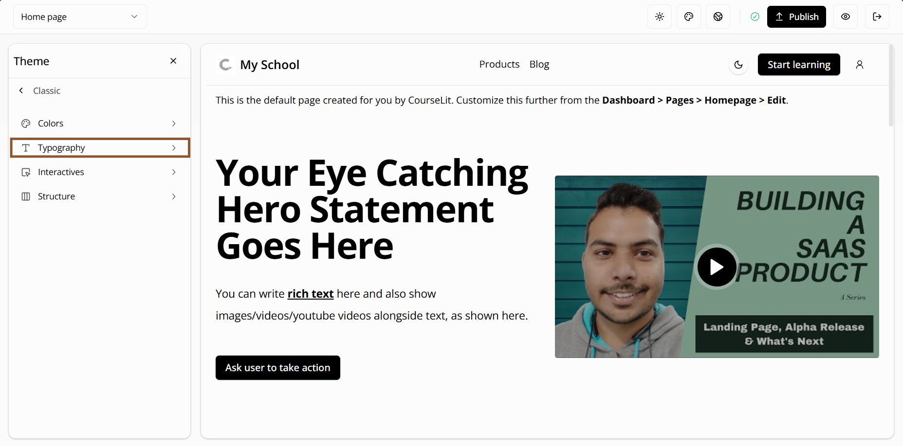
The typography editor lets you customize text styles across your website. These are organized into categories:
Headers
- Header 1: Large titles for main page headings
- Header 2: Medium titles for major sections
- Header 3: Smaller titles for subsections
- Header 4: Small titles for minor sections
- Preheader: Introductory text that appears above headers
Subheaders
- Subheader 1: Primary subheaders for section introductions
- Subheader 2: Secondary subheaders for supporting text
Body Text
- Text 1: Main body text for content
- Text 2: Secondary body text for supporting content
- Caption: Small text for image captions and footnotes
Interactive Elements
- Link: Text for clickable links
- Button: Text for buttons and calls-to-action
- Input: Text for form fields and search boxes
For each text style, you can customize:
- Font family: Choose from a variety of professional fonts
- Font size: From Extra Small to 9X Large
- Font weight: From Thin to Black
- Line height: From None to Loose
- Letter spacing: From Tighter to Widest
- Text transform: None, Uppercase, Lowercase, or Capitalize
- Text decoration: Underline or no underline
- Text overflow: How text behaves when it’s too long
Supported Fonts
CourseLit provides a carefully curated selection of professional fonts, organized into categories:
Sans Serif Fonts
- Inter: A modern, clean font perfect for digital interfaces
- Open Sans: A highly readable font designed for screen use
- Source Sans 3: A versatile font with excellent legibility
- Noto Sans: A font designed to support all languages
- Roboto: Google’s signature font, clean and modern
- Mulish: A geometric sans-serif with a modern feel
- Nunito: A well-balanced font with rounded terminals
- Work Sans: A clean, modern font with a geometric feel
Serif Fonts
- Merriweather: A serif font designed for comfortable reading
- Alegreya: A serif font with a calligraphic feel
- Playfair Display: An elegant serif font for headings
- Roboto Slab: A serif variant of Roboto
- Source Serif 4: A serif font designed for digital reading
Display Fonts
- Montserrat: A geometric sans-serif with a modern feel
- Poppins: A geometric sans-serif with a unique character
- Raleway: An elegant sans-serif with a unique ‘w’
- Rubik: A sans-serif with a geometric feel
- Oswald: A reworking of the classic style
- Bebas Neue: A display font with a strong personality
Modern Fonts
- Lato: A sans-serif font with a warm feel
- PT Sans: A font designed for public use
- Quicksand: A display sans-serif with rounded terminals
Each font is optimized for web use and includes multiple weights for flexibility in design. All fonts support Latin characters and are carefully selected for their readability and professional appearance.
3. Interactives
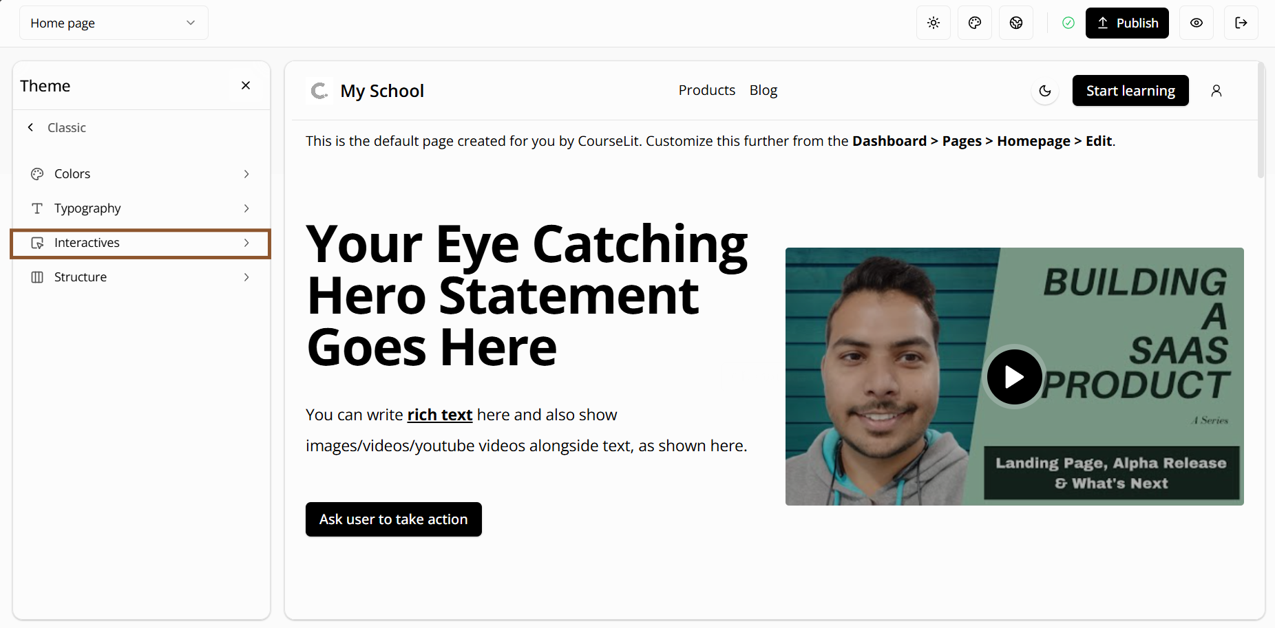
The interactives editor allows you to customize the appearance of interactive elements:
Button
- Padding: Space around the button text (None to 9X Large)
- Border style: Choose from None, Solid, Dashed, Dotted, Double, or Hidden
- Shadow effects: From None to 2X Large
- Custom styles: Add your own custom styles using supported Tailwind classes
- Disabled state: How the button looks when it can’t be clicked
Link
- Padding: Space around the link text
- Border style: Choose from various border styles
- Text shadow: Add depth to your links
- Custom styles: Add your own custom styles using supported Tailwind classes
- Disabled state: How the link looks when it can’t be clicked
Card
- Padding: Space around the card content
- Border style: Choose from various border styles
- Shadow effects: Add depth to your cards
- Custom styles: Add your own custom styles using supported Tailwind classes
Input
- Border radius: Round the corners (None to Full)
- Padding: Space inside the input field
- Border style: Choose from various border styles
- Shadow effects: Add depth to your input fields
- Custom styles: Add your own custom styles using supported Tailwind classes
- Disabled state: How the input looks when it can’t be used
4. Structure
The structure editor lets you customize the layout of your pages, like section paddings and maximum page width.
Page
- Maximum width options: - 2XL (42rem): Compact layout - 3XL (48rem): Standard layout - 4XL (56rem): Wide layout - 5XL (64rem): Extra wide layout - 6XL (72rem): Full width layout
Section
- Horizontal padding: Space on the left and right sides (None to 9X Large)
- Vertical padding: Space on the top and bottom (None to 9X Large)
Publishing Changes
All changes you make to a theme are saved as drafts. To make your changes live:
- Review your changes in the theme editor
- Set the theme as active on your school
- Click the “Publish” button to publish both content and theme changes
- Confirm the publication
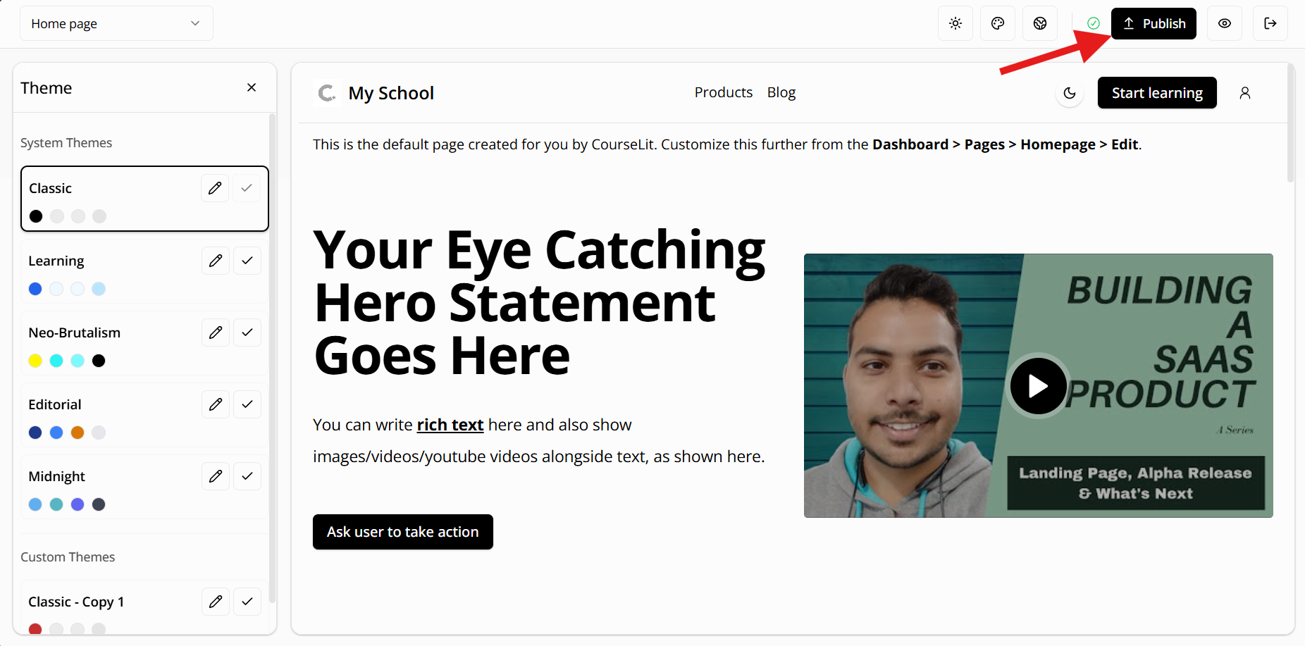
Your changes will now be visible to your website visitors.
Switching Themes
To switch between themes:
- Go to the theme selector
- Choose the theme you like
- Click the button with a tick icon on your desired theme
- The theme will be applied immediately
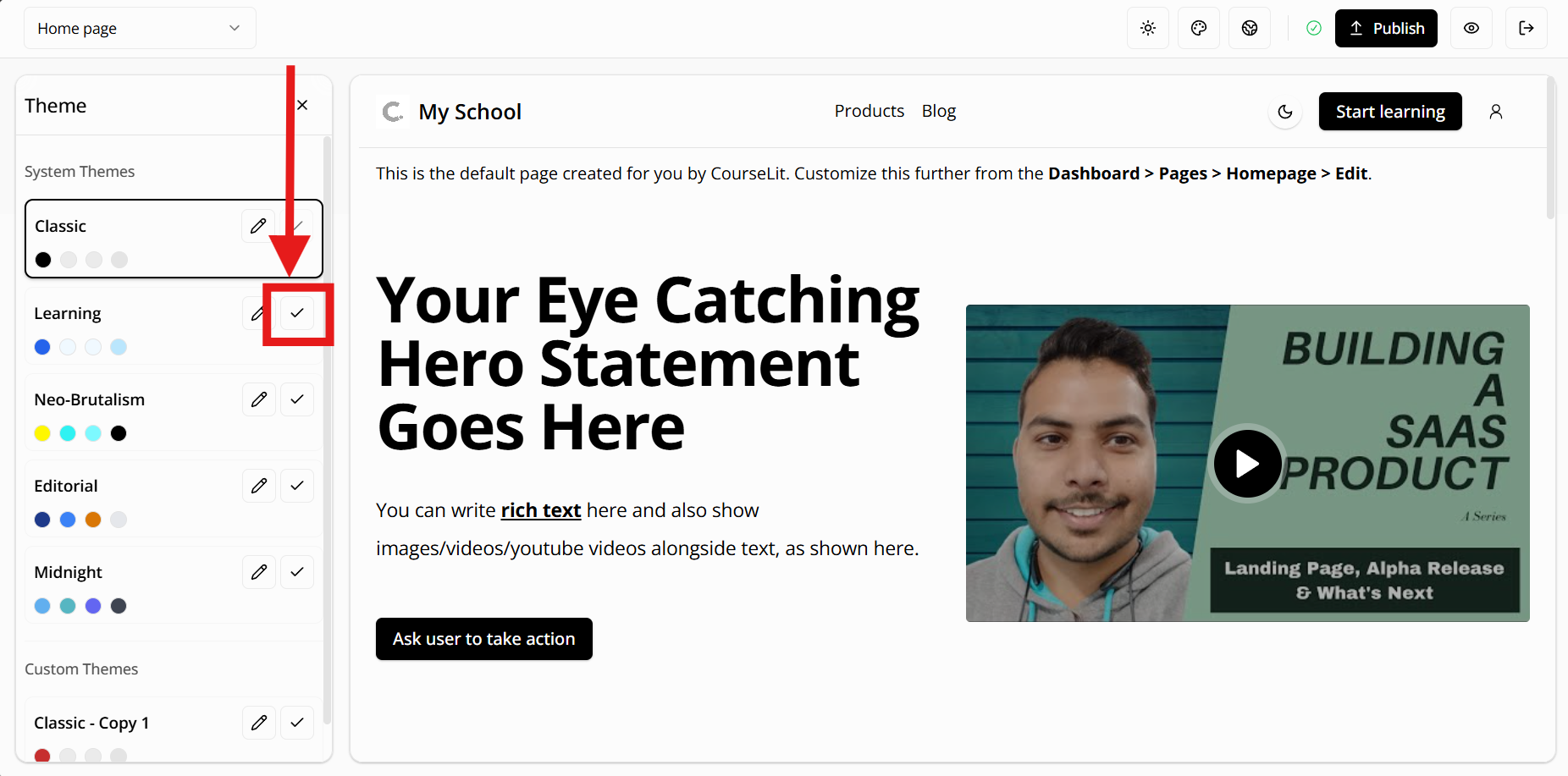
Note: Switching themes will affect your entire website’s appearance. Make sure to test the theme thoroughly before making it live.
Supported Tailwind Classes
When adding custom styles to interactive elements, you can use the following Tailwind classes:
Typography
Font Sizes
text-sm: Small texttext-base: Base text sizetext-lg: Large texttext-xl: Extra large texttext-2xl: 2X large texttext-3xl: 3X large texttext-4xl: 4X large texttext-5xl: 5X large texttext-6xl: 6X large texttext-7xl: 7X large texttext-8xl: 8X large text
Padding
Vertical Padding
py-4topy-20: Vertical padding from 1rem to 5rem
Horizontal Padding
px-4topx-20: Horizontal padding from 1rem to 5rem
Colors
Background Colors
bg-{color}-{shade}: Where color is one of:- slate, gray, zinc, neutral, stone
- red, orange, amber, yellow, lime
- green, emerald, teal, cyan, sky
- blue, indigo, violet, purple
- fuchsia, pink, rose
- And shade is one of:
- 50, 100, 200, 300, 400
- 500, 600, 700, 800, 900, 950
Text Colors
text-{color}-{shade}: Same color and shade options as background colors
Variants available: hover, disabled, dark
Transitions
Transition Properties
transition: All propertiestransition-colors: Colors onlytransition-opacity: Opacity onlytransition-shadow: Shadow onlytransition-transform: Transform onlytransition-none: No transition
Duration
duration-0: No durationduration-75: 75msduration-100: 100msduration-150: 150msduration-200: 200msduration-300: 300msduration-500: 500msduration-700: 700msduration-1000: 1000ms
Timing Functions
ease-in: Ease inease-out: Ease outease-in-out: Ease in and outease-linear: Linear
Transforms
Translate X
translate-x-1totranslate-x-10: Move righttranslate-x-[-1]totranslate-x-[-10]: Move left
Translate Y
translate-y-1totranslate-y-10: Move downtranslate-y-[-1]totranslate-y-[-10]: Move up
Scale
scale-0: No scalescale-50: 50% scalescale-75: 75% scalescale-90: 90% scalescale-95: 95% scalescale-100: 100% scalescale-105: 105% scalescale-110: 110% scalescale-125: 125% scalescale-150: 150% scale
Shadows
shadow-sm: Small shadowshadow-md: Medium shadowshadow-lg: Large shadowshadow-xl: Extra large shadowshadow-2xl: 2X large shadowshadow-inner: Inner shadowshadow-none: No shadow
Variants available: hover, dark
Borders
border-solid: Solid borderborder-dashed: Dashed borderborder-dotted: Dotted borderborder-double: Double borderborder-none: No border
Variants available: hover
Text Decoration
underline: Underline text
Variants available: hover
Layout
Maximum Width
max-w-2xl: 42remmax-w-3xl: 48remmax-w-4xl: 56remmax-w-5xl: 64remmax-w-6xl: 72rem
Variants available: lg
Note: All
hovervariants are available for interactive elements.darkmode variants are available for colors and shadows.
Need Help?
We’re here to help! Join our Discord community or reach out to us on Twitter for support.